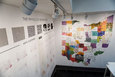
Colorful maps adorn white walls at Tufts University’s School of the Museum of Fine Arts’ Well and Weems Atrium gallery. Vibrant hues of green, orange, pink and blue draw attention to the shapes. The bright colors and shapes, seeming randomly drawn, determine the future of United States politics.
Introduced this fall semester, “Election” is an installation that addresses electoral politics and the complicated dynamic of gerrymandering across the United States.
Through data graphing and electoral maps, Tufts math professor and artist Moon Duchin said she sought to visualize the nation’s political intricacies to help audiences reach a better understanding of gerrymandering and its implications for voters.
Gerrymandering is a political practice that manipulates district boundaries within a state to establish party dominance. It remains a significant issue, particularly within the House of Representatives and Senate races, and is a campaign issue particularly for Democrats, according to an NPR podcast.
“Election,” in keeping with this year’s campaign season, was unveiled in early September at the SMFA gallery and will remain until Dec. 20.
Duchin, a 2018 Guggenheim Fellow, has focused on voting rights and restrictions as her research focus for the past two years, she said, and in the spring was approached by her colleague Abigail Satinsky, curator of SMFA’s galleries. Satinsky asked her to create an installation for the gallery space.
This summer, Duchin ran the Voting Rights Data Institute summer program held at Harvard University, the Massachusetts Institute of Technology and Tufts. The program was a summer research effort involving 52 graduate and undergraduate students.
Together, Duchin and her team stitched together voting data and maps to portray the “shapefile” of each state and its districts. “Election” was essentially born from the team’s efforts to create powerful visuals for their research, Duchin said.
One prominent piece is a map of Ohio, often considered one of the most gerrymandered states, which was painstakingly stitched together by various partisan voting data provided by all 80 counties. The piece took over 400 hours to research and assemble, Duchin said.
But the results were immediate: within one week of releasing the digital map, a legal team from the ACLU used it to sue Ohio over its gerrymandered districts, according to Duchin.
“We’re on the front lines of efforts to rein in gerrymandering around the country,” Duchin said. “I hope the piece helps show the complexity of the problem, the stakes and also demonstrates that we’re making progress in tackling it.”
Another piece, “One Mississippi, Two Mississippi” highlights the many different ways states cut themselves up into districts. The piece presents 14 “alternative Mississippis” – or the different ways of dividing the state into its four congressional districts.
Duchin and her team used random walk algorithms to generate millions of different Mississippi plans, she said.
Duchin said that it’s fairly easy to create valid plans that would send a whole different delegation to Washington. Instead of concentrating African-Americans in one district, a different plan could ensure that three out of four districts couldn’t elect any candidate without significant black support, she said.
“The visual just looks like high school geometry — cover the state with colored shapes,” Duchin said. “But the consequences are enormous: who gets to make policy and control the direction of the country.”
Throughout the installation, Duchin said she relied on the design skills of SMFA professor and artist Floor van de Velde, who helped consult with Duchin on the project’s direction, layout and organization.
Van de Velde had a limited understanding of gerrymandering before her work with Duchin, she said. Now, however, she said she pays closer attention to state and local politics and their gravity within the larger nation.
“Gerrymandering is something everyone knows a little bit about, but not to its full extent and power,” van de Velde said.
Using mathematics and geometry, the installation reshapes the concept and presents new modes of understanding.
“Election” is just one moment within the ongoing Artists in Response exhibit, a revolving gallery space at SMFA that changes each semester, inviting new artists and creative leaders to respond to their own contemporary social movements and crises, Satinsky said.
“Election” is partnered with For Freedoms, “a national platform for civic engagement, discourse, and direct action for artists in the United States,” according to SMFA’s webpage.
Satinsky, a writer and organizer of socially engaged art herself, said she is interested in furthering political discourse among artists who hold a critical and creative voice within the national dialogue.
Duchin echoed Satinsky, saying that “art can be incisively political without being didactic. It can teach without lecturing.”
On Oct. 4, Artist Response held an “Election” teach-in at SMFA. There, Duchin presented her work with the Voter Rights Data Institute, offered voter registration and discussed local and national political concerns.
“Election” engages audiences in the history of the nation’s past and present, Satinsky said. Although the installation tries to clarify political abstractions, it makes no effort at providing solutions. It simply helps to understand how the nation got to its contemporary moment, Satinsky said.
“Gerrymandering is not a simple problem to solve,” Satinsky said. “It needs all different kinds of voices to contribute in order for progress to happen because it is about math, but it is also about representation.”