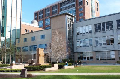
Boston University’s College of Communication could get a potential facelift this coming summer, which is sparking discussion on changes that may be brought to the building.
After the construction of the new Center for Integrated Life Sciences and Engineering building, there has been discussion for doing work on the exterior of the COM building — particularly for changing the gray limestone material this summer, COM Dean Thomas Fielder said.
“One of the problems that has come up over many years as you can see is the limestone that is the facing of the COM building has weathered in such a way that it looks blotched,” Fielder said.
Fielder attributes this appearance to the moisture from snow and rain.

“There was some funding to do some cosmetic work on the COM building so that it would blend in with that style,” Fielder said. “[The architects] are thinking some type of stain [on the exterior] so that it would be a uniform color.”
Another way to make the color more uniform with the rest of the school is by adding red banners to match with the theme of BU, which has been suggested by other architects, Fielder said.
In addition to changes to the facing of the building, there has also been discussion to change other parts of the COM building.
Project Executive for the CILSE Walt Meissner is a part of these conversations. He said there was “an opportunity to spruce up the building and clean it up.”
“In the context of that, we just sort of naturally started saying how do we draw attention that this is the COM building and that’s bringing a different layer of what might also be done,” Meissner said.
To include student and faculty voices, Fiedler held a design forum Wednesday evening to start a conversation on other additional changes that could be done to the building. COM professors and students attended the forum to share their ideas.
Meissner, who was also in attendance, said this was a forum to talk about different opportunities.
“How do we do this in a tasteful and not too costly way; how can we do something to make this [building] nicer,” Meissner said.
During the forum, Fielder brought up another concern for the building, which is that the main entrance is difficult to identify.
“With the new CILSE building … and because we have the external staircase, your eye would tell you the main entrance is the side one,” Fielder said. “Another thing we could accomplish with the new design is some kind of a focus with design elements that would tell you that that’s the main entrance.”
In addition, Fielder proposed an idea for covering part of the building with a material called “scrim” or a printed reflective screen to project films or student work.
“This could make the building living, which is an idea to bring life to COM,” Fielder said.
COM students who attended the forum also had their own ideas for the building.
Zoe Qian, a junior studying public relations, proposed her idea to add lighting to the entrance using communication symbols, such as emojis. She also proposed to put on display student work somewhere in the building.
“We don’t have something that represent COM’s students’ character that’s creative, being flexible and doing outside of the box things,” Qian said. “I’m thinking if I’m bringing in some artwork that represents some of the values that we are.”
Caroline Barry, a COM freshman, said she finds the building uninviting for a college that houses creative majors and projects.
“I think it’s important to be in an inviting environment and have enough space to accommodate people who spend a lot of time there,” Barry said. “I think color would definitely add to it and getting rid of the cold, concrete brick look.”


Excellent student ideas!! I like all of them! I love the thought of the scrim to project student work and make the COM building “living!”