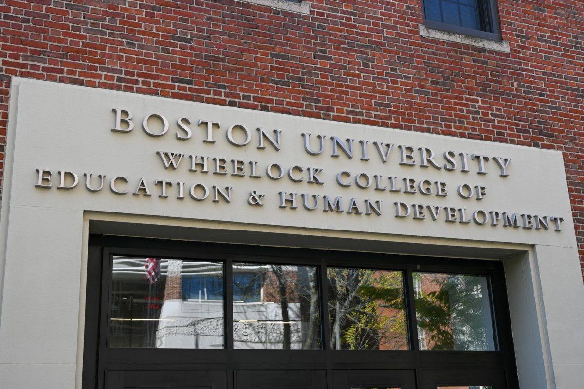
After a year and a half of hard work, the Boston University administration can say it has streamlined its logo and signage, but some students are questioning the projects the university signs off on.
The new-and-improved logo revealed last week, which was developed by Toth Brand Imaging, is a slight update on the previous red rectangular design — the white line separating “Boston” and “University” has been removed in favor of slightly altered font and spacing.
“It’s funny how you hear about little stuff like this, but you don’t hear about major stuff,” College of Arts and Sciences senior Robert Kavanaugh said. “I mean tuition goes up 5 percent every year, and I’ve seen my logo changing . . . it looks exactly the same.”
Kavanaugh said he could not tell the difference between the old and new logos.
“I doubt people will notice,” College of General Studies sophomore Angie Thrower said. “I think it was a ridiculous waste of time to bother changing it. I feel like the old one is a lot better.”
BU spent nearly two years discussing and implementing the change in an attempt to unify the university, because different schools were using different versions of the same logo. BU Vice President of Marketing and Communications Steve Burgay said the new logo will not interfere with creativity.
“We never had any rules or guidelines before, people could vary it,” Burgay said. “[The website] lays out all the rules . . . Like any institution we have to present ourselves in public. Diversity will happen, but we have the logo that is consistent.”
Toth Brand Imaging worked on the project for about six months, coming up with five potential logos, Toth Director of Business Bob Fouhy said. The runner up for the new logo was a “more modern use of a circle,” while the chosen logo was a mix of “traditional” and “modern” concepts, he added.
CAS junior Vanessa Gusick said removing a line does little to help to unify a university.
“I feel like if they really wanted to make a big impact in changing the sign, they really didn’t accomplish that goal,” Gusick said. “They should have used some sort of design.”
Creative Director for the Office of New Media Scott Dasse said the logo is not “new,” but rather “revised.”
“The real work was making a system that allowed different entities to identify themselves . . . as a part of BU,” Dasse said. “[The logo] wasn’t sacred, we made it sacred.”
CFA Executive Director of External Relations Ellen Carr said she worked with the Office of New Media on a website, which provides new logo guidelines. She added that the recommendations are not mandatory.
Dasse said the goal of the project is to make things easier.
“I don’t think anyone in their right mind would be in an uproar about this looking a new way; BU is BU,” Kavanaugh said. “It says Boston University. Why can’t you have a bunch of different ways? Why can’t you be creative? Why do you have to have one set?”
Staff reporters Katrina Ballard, Vivian Ho and Lizzy Snell contributed to the reporting of this article.

