


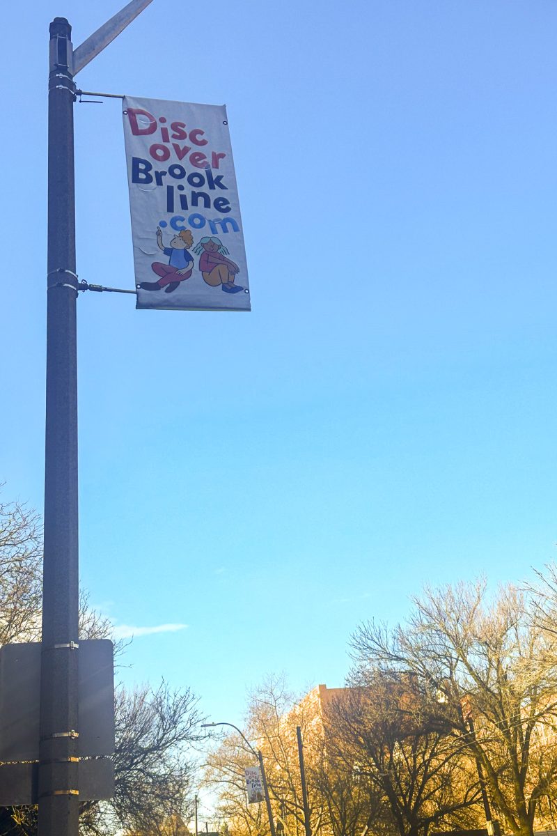


I noticed yesterday that there are new banners on the street poles up and down campus. I can remember the first time I came to visit Boston University, and as I gazed from my car window the big red banners called out, “Welcome to Boston University… this is our campus!” Maybe they didn’t really call out to me, but for a city school without a truly defined campus and center quad, these banners defined the campus and did a wonderful job.
However, as a graphic design student in the College of Fine Arts, I’d have to say that the new banners that hang above our campus streets do nothing but catch my eye (hopefully because they are new) and then aggravate me because of their poor design and horrid colors (with the exception of BU red). The use of a more modern sans-serif typeface to spell Boston University may have been alright had it been treated in a modern way, but instead it is centered and left lonely in the middle of a huge banner. The imagery and type on the banners, which hang on either side of the poles, are seemingly designed for single banners for each side, rather than trying to create a beautiful and unified image to hang above our streets.
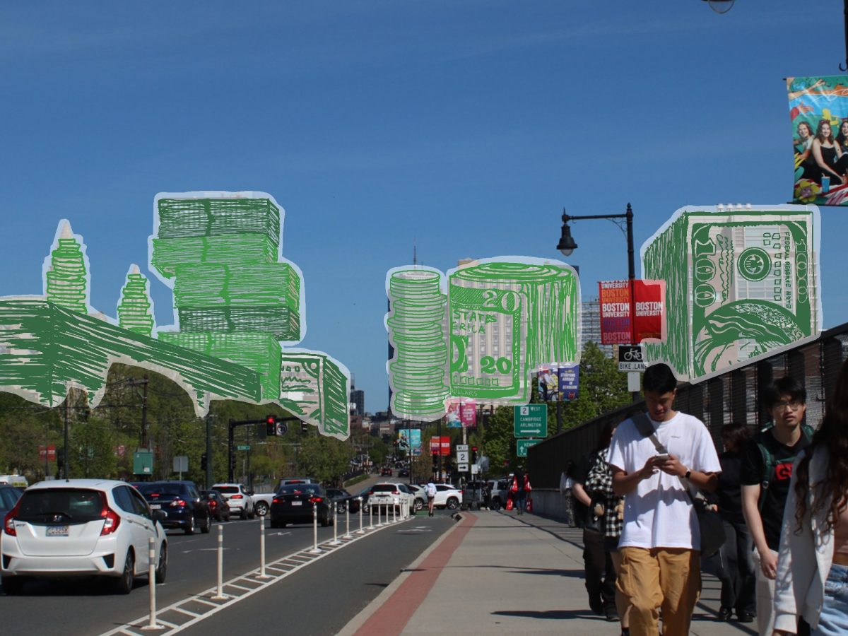
There are also “special” banners scattered throughout the Boston University campus which celebrate the past and look forward to the future. I’m sorry I can’t quote exactly what the banners read, but the type treatment and color choices vibrate so much it makes me nauseous. The type treatment on the “special” banners was without a doubt done by someone who was unaware that there is an entire process of setting and arranging type called typography. Banners aren’t cheap. I know Boston University has a lot of money, and during the two, almost three, years I’ve spent on campus I’ve seen it put to use in many wonderful ways and some questionable ways. But this is definitely a case where a lot of money was spent to “beautify and refresh” our campus, and it completely backfired. BOOM!
Nick Zegel CFA ’07