


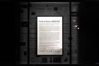
Radical Return — an exhibition that features work from 36 Chinese and Chinese-American graphic designers and artists around the world — is on display at the Faye G., Jo, and James Stone Gallery at Boston University and at IS A GALLERY in Shanghai, China until Dec. 12.
The theme of the exhibition is the Chinese character 回 — pronounced ‘hui’ — which means “return,” co-curators Kai Li and Mary Yang said. The grid-like character inspired the artists both conceptually and visually, Li said.
“We’re really just using that Chinese character, or ‘hui,’ as a starting point of inquiry,” said Yang, assistant professor of art and graphic design in the College of Fine Arts. “We actually did a call for submissions for this exhibition … we gave them a 24-by-24 grid file.”
Radical Return is the first project created by “Radical Characters” — a study group initiated by Yang and Li earlier this year dedicated to connecting the design and culture of Chinese and Chinese-American designers.
Danielle Chang, a junior in CFA and the exhibition and design assistant, said the designers responded to the theme of “returning” by playing on the geometric shape of the character’s “square within a square.”
Not only is each work in Radical Return based on ‘hui,’ but the exhibition space itself is as well, Chang said. Hanging on the four walls are the submissions, and at the center of the square-shaped room is a low table filled with books on Chinese typography and graphic design.
One designer featured in the exhibition, Daedalus Guoning Li, said they thought about the meaning of “returning” in refamiliarizing themselves with their cultural identity after changing in a fundamental way.
Daedalus Li, a multimedia designer from China, now in the MFA program for graphic design at Yale University, described a “misalignment” between their Chinese cultural identity and identity as a non-binary queer person of color in the United States.
“I see these two as two parallel trajectories, but sometimes they overlap, they collide,” Daedalus Li said. “Sometimes it’s not really [a] harmonious or enjoyable collide, rather than maybe a slightly stressful one.”
They added that sometimes, others may see a change in their identity as a “mutation,” but they choose to embrace it to bridge their two identities together.
“I’ve essentially changed or fundamentally changed, so that’s why I talked about embracing mutations,” they said. “In a way, the mutation is more like an outside gaze towards my change, it seems more like a mutation towards my own cultural heritage or cultural identity.”
They said they illustrated this in their Radical Return submission by conceptualizing how the mutation would affect the “normal” way of writing in calligraphy, which traditionally follows strict rules on how the brush should move. Instead, in the work, they “really exaggerate each turn and deform it, giving quite a dramatic effect to each turn,” they said.
Another designer featured, Gene Hua, an interaction designer at the Whitney Museum of American Art, interpreted “return” as returning to a pre-digital age when every character was handwritten instead of electronically typed, allowing for the spontaneous creation of new characters.
“For example, there are movements in Chinese culture to create a gender-neutral pronoun, and in languages that use Latin or alphabet-based characters … it’s relatively easier,” Hua said. “In Chinese, it’s really hard to create a whole new pronoun because you just can’t type it.”
Hua’s work in the exhibition is centered around one of 12 “ghost characters” — Chinese characters that were accidentally created when the Japanese government was trying to encode every single ‘kanji’ in existence, Hua said.
His piece features a “ghost character” faded in the background in an ethereal, ghost-like way, referencing the name of this collection of characters, Hua said.
Yang added that there are English and Chinese translations throughout the exhibition both to increase accessibility and include a way for people to practice their language skills.
“As an educator too, it’s important to … feature work by Chinese and Chinese-American graphic designers, and we haven’t really seen much of that out there, at least in the design communities that we’re in,” Yang said. “So this is our chance to make space and time for that.”
Hua, who is Chinese-American, said Radical Return helped him feel more comfortable engaging with the Chinese language through design.
“Graphic design is so much about picking at cultural cues and working with how people understand the world already,” Hua said. “To me, this was kind of pushing myself out of those boundaries and making myself a little uncomfortable engaging with this cross-country, cross-continent dialogue.”
Yichen Ma, a senior in the College of Arts and Sciences, said the usage of Chinese characters is a strong way of connecting Chinese people with Chinese-Americans.
“The concept of return means a lot to Chinese international students because a lot of us are eager to return to our home,” Ma, who is from Shanghai, China, said.
Vicky Huang, a sophomore in the College of Communication, said the population of Chinese students on campus is large but not often represented on campus like they are in this particular exhibit.
“I feel like a lot of times people will try to dictate the differences between the two [communities], which, obviously there are,” Huang, who is Taiwanese-American, said. “But by bringing them together, they’re able to unify into one artistic exhibit and show that even if we’re all different, we all have our own ways of expressing our cultural pride.”
Yang said the use of the word “radical” in the name of the exhibition is a double entendre, referring to both Chinese radicals, the base components of Chinese characters, and radical as an adjective — the unique idea of basing graphic designs on the geometry of Chinese characters.
As the exhibition at Stone Gallery nears closing hours each day, its partner exhibition in Shanghai prepares to open, creating a constant exhibition.
“We wanted the conversation to not die out but be preserved even if it was going to be in a different location,” Chang said. “This conversation should always be in motion and always be in the light [even] when it’s dark.”