By Sophia Hebert and Jessie Sage O’Leary
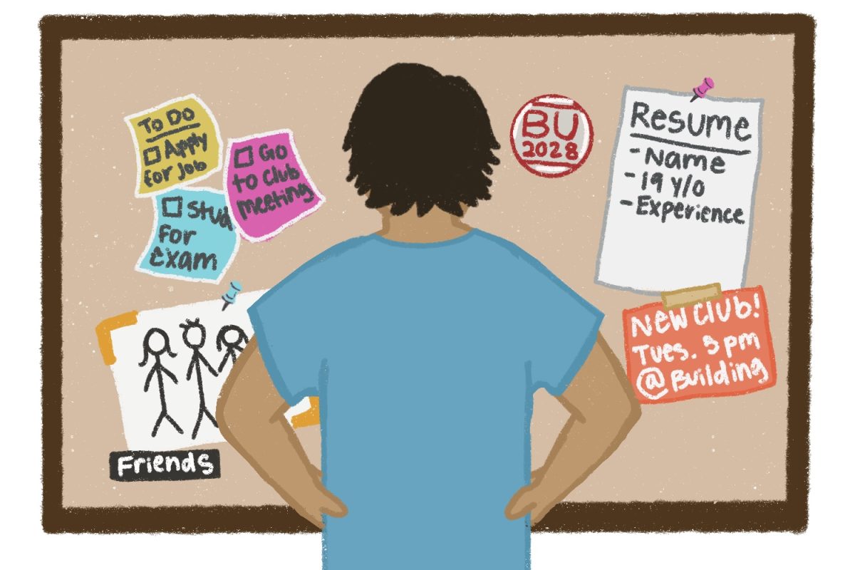
Boston University students expressed opinions about the new Student Link, “MyBU,” following its March 6 launch, with some saying the update was unnecessary and confusing.
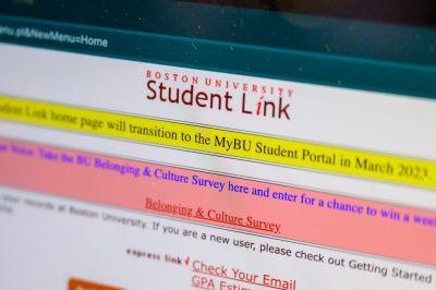
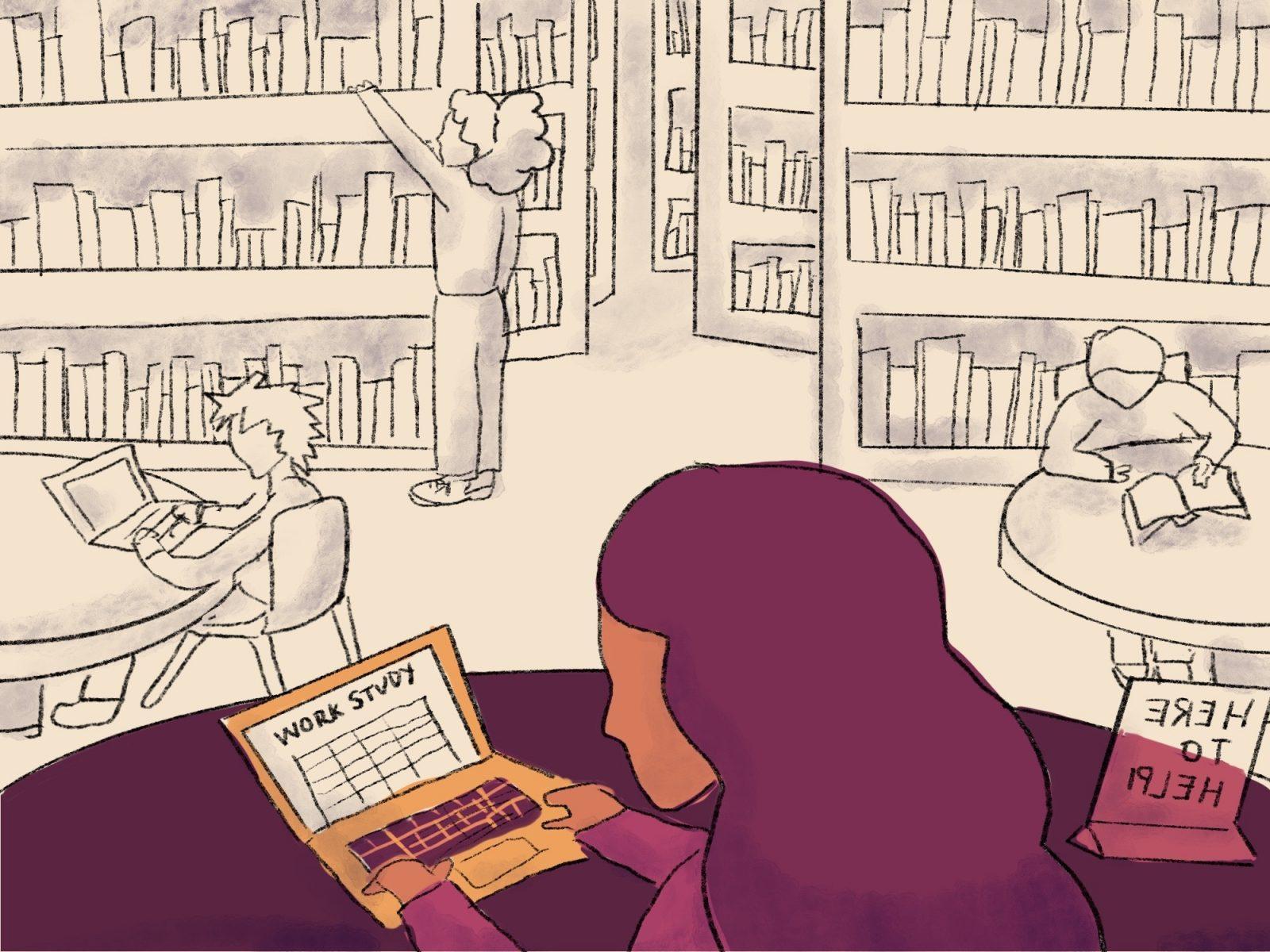
The recent update only replaced the homepage of BU’s former student portal, Student Link, which BU students used to access their class schedules, pay bills, register for classes, view their grades and more.
Students played a part in creating the MyBU Portal, according to the Office of the Provost, which wrote that BU students shared their recommendations and tested the portal before it went live this month. However, several BU students said that the MyBU Portal was not what they expected.
Tracy Schroeder, vice president of Information Services and Technology, said the negative student response was not expected.
“We hoped, based upon student input and feedback during design and development, that students would appreciate the updated look and improved usability,” Schroeder wrote in an email. “I expect that personalization and the introduction of new service capabilities will be positively received.”
Schroeder wrote she heard concerns through the Undergraduate Student Advisory Board, which included, “initial trouble with a navigation bug (now fixed), concern about Laundry room status availability not being findable…[and] concern that pictures in the interface slow down navigation.”
Minseob Kim, a sophmore in the College of Arts and Sciences, said that the MyBU Portal is harder to navigate than Student Link.
“It was really difficult to navigate through all the menus because of how complex it became,” Kim said. “I wish they either had a tutorial for everything or made it much more easier to use.”
Kim said that, despite the old Student Link’s dated look, it got the job done.
“The old Student Link…looked kind of ugly, but it worked for the purposes it was intended,” he said. “I think the idea was good because the Student Link is supposed to be for the students, so it doesn’t need to look pretty for outsiders.”
Taylor Hill, a senior in CAS, said updating Student Link was a “waste of time and effort.”
“It’s basically the same as the old one,” Hill said. “I wouldn’t see the point of changing it at this point if it’s exactly the same.”
Sophia Eye, a sophomore in the College of Communication, said that the transition from Student Link to MyBU is challenging for students.
“I think [MyBU] is harder for current BU students because it changed the format so much,” Eye said. “I wouldn’t say it’s super confusing, but I wouldn’t say it’s the best system.”
Eye said that although the old student link was an “atrocity,” she liked its reliability.
“I think it was something coded in 2003 and they haven’t changed it since. However it worked…[Student Link] did need an appearance change, but the organization of it was good,” she said.
Eye said she thinks the MyBU Portal should have been released when it was fully completed, not in stages.
“I think that they should have waited until they could make a better system in total, instead of just trying to sweep the dust under the rug.”
However, Eye still added she is hopeful that SIS can improve MyBU and make it a better system.
“They’re trying and I think that that’s good,” she said. “I think that they’re slowly getting to where it needs to be, however, I don’t think it’s there yet.”
Schroeder wrote she still has high expectations on the upcoming transformation process with the Student Link.
“MyBU is the first step in a multi-phase deployment of our new Student Information System, which will continue through July of 2024,” she wrote. “We have been working to bring about this transformation for many years, and I am excited to deliver a modern students experience to BU students.”






































Anonymous • Mar 24, 2023 at 11:27 pm
I think its a great step forward! It would be better if it was rolled out all at once during the summer or winter break to avoid confusing students in the middle of the semester and avoid a half-assed approach at an improvement. The current “update” links back to the original student link anyways so its useless in that sense. It would’ve made more sense to just role it out all at once, and while that’s still developing send specific emails to students that are open to testing it out on their own time.